
The Davis Food Co-op Case
In 2019, I became part of the Davis Food Co-op, and my bond with this brand goes beyond their community contributions. They provided me a unique opportunity to delve into unexplored realms of graphic design, encompassing aspects like branding, layout, and campaigns.
This transformative journey led us to focus on rejuvenating and aligning different facets of the brand, a narrative I'm excited to share with you below:
Embarking on the challenge of rejuvenating the DFC brand was a captivating odyssey. The brand bore the marks of diverse marketing managers throughout its evolution, creating a mosaic of influences. Amidst this kaleidoscope, I held steadfast to their distinctive color palette, even as the prevailing brown shade, symbolizing the soil and agricultural ties, failed to captivate the eye. Despite its historical significance, I recognized the need for a visual transformation. Is when this journey started, I was looking to infuse a new vibrancy into the DFC brand, preserving its legacy while embracing a palette that truly resonates with the modern gaze.

THEN
Behold a glimpse into the varied signage landscape that greeted me upon initiating the much-needed revitalization of DFC's brand.


With the green light from the Marketing Manager, we made a strategic move to relegate the brown color to a secondary role within the brand. Introducing a serene blue tone, symbolic of the sky, we aimed to convey the brand's outlook toward new opportunities and connections. This shift reflects our commitment to a fresh perspective and the limitless possibilities that lie ahead.
NOW

Armed with these guidelines, we embarked on a journey to transform signage across various departments, revealing a more contemporary and approachable image. Choosing beige as a
calming backdrop and enhancing the use of the blue not only for aesthetics but also for readability
by shoppers. To add a touch of practicality, we incorporated timeless imagery, shifting from
ever-changing farm images to department-specific visuals. This not only represented cost savings but also ensured that our signage endured the test of time, sparing us frequent updates. Our mission?
To capture the very essence of what DFC stands for, resisting the erosive forces of time. The outcome?
A modern, enduring visual tale harmonizing with the dynamic spirit of DFC.


In the midst of this transformative process, a revelation surfaced regarding our weekly sales flyers. Despite printing around 20 copies each week, a significant portion—approximately 10-13 flyers—remained untouched by week's end. Recognizing an opportunity for improvement, I took the reins to revamp the layout and format, ensuring it was not only eye-catching but also effortlessly readable.
The results were nothing short of remarkable – the redesigned flyer captured attention, prompting a surge in its popularity. Currently, we print 100 copies weekly, with only about 20 left unclaimed. This metamorphosis translated into heightened sales across departments, as the revamped flyer reached a broader audience, allowing me to showcase more enticing items within its pages.

Another transformation I spearheaded was the revamp of our Staff Newsletter. Observing that the colors, aside from deviating from the brand, failed to captivate the human eye, I undertook a series of format explorations. Eventually, I settled on a design that infused an element of fun and eye-catching appeal, ensuring our newsletter became a delightful informative visual experience.
THEN
NOW
THEN

NOW

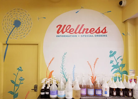
Embarking on the exhilarating journey of reimagining our brand, our mission shifted towards injecting joy and charm into every facet of the shopping experience. The canvas of transformation extended to diverse projects, including the embellishment of the Community Board, the Wellness Department Counter, aisle signs, the Customer Service Desk, and even the patio tables, among other exciting endeavors. In a burst of creativity, I envisioned the patio tables as vessels for the cooperative values and Ends of the DFC – the very heartbeat of its vision. This was a conscious effort to educate the public in a delightful and engaging manner, seamlessly weaving the cooperative spirit into the tapestry of our shoppers' experience. To add a playful touch, I decided to whimsically incorporate the tomato – a symbolic nod to the region and a key element in our logo – throughout the store, infusing a touch of local charm into every corner.
THEN

NOW
.jpeg)


And, finally, the most enjoyable aspect of my role was crafting imagery for the Staff and customer merchandise. My aim was simple: to produce visuals that are not only fun and eye-catching but also break away from the conventional corporate designs. Opting for a fresh, modern approach, I incorporated familiar landmarks and signs, providing a touchpoint for easy identification. Infusing a playful spirit, I brought the tomato from their current logo to life, creating a charismatic character "Tomatito or Little Tomato" that sparks the desire for people to embrace these products with enthusiasm.
THEN


NOW


